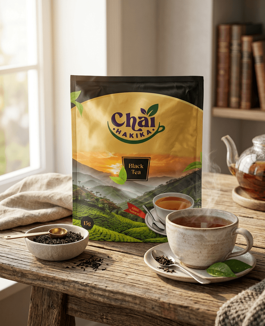
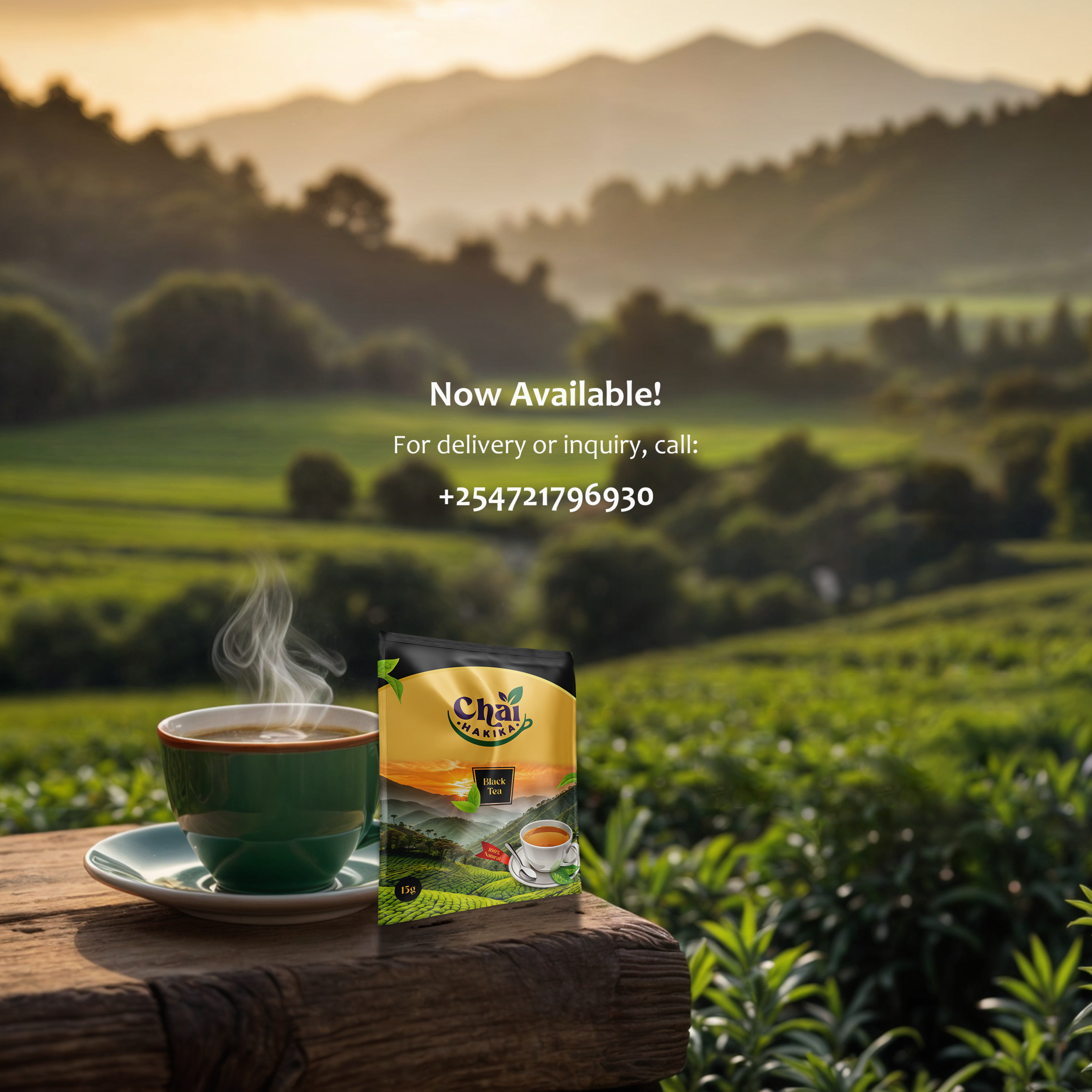
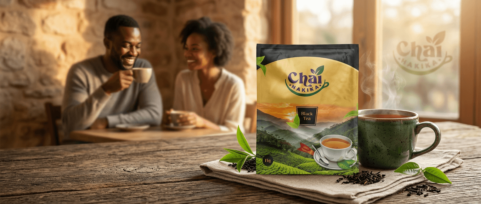
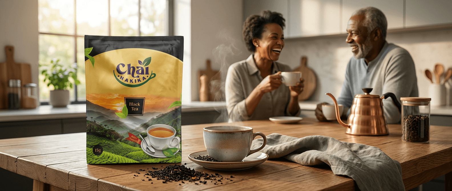
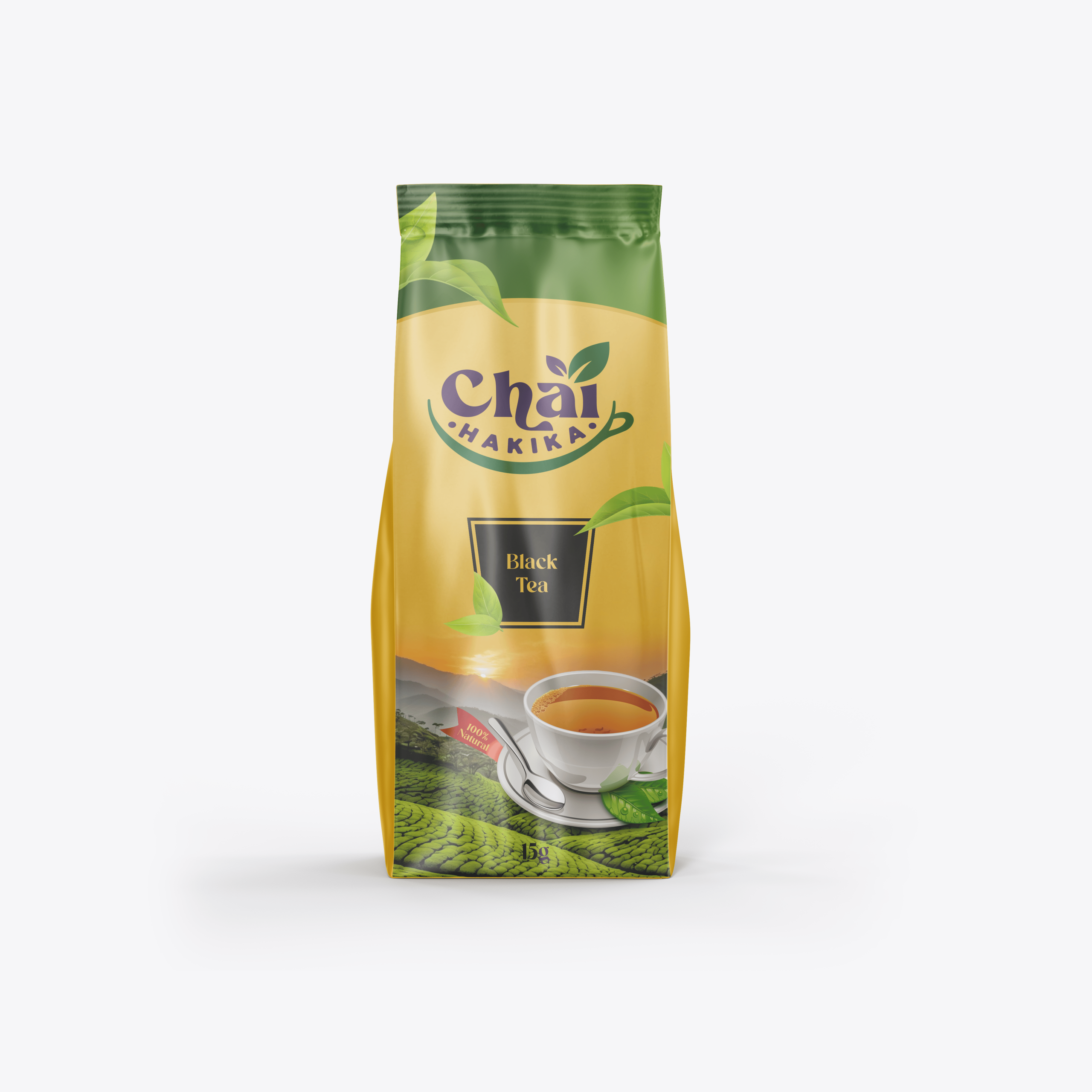
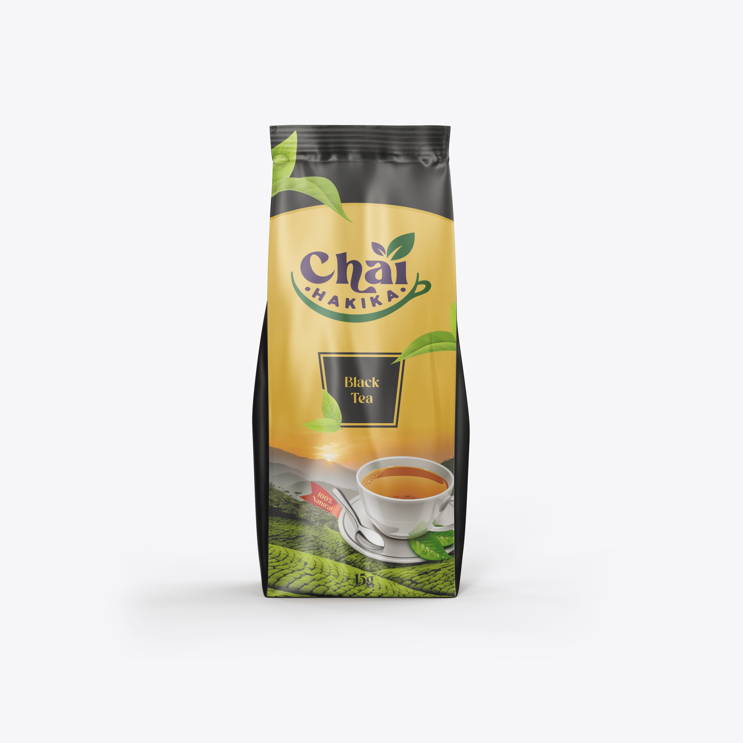
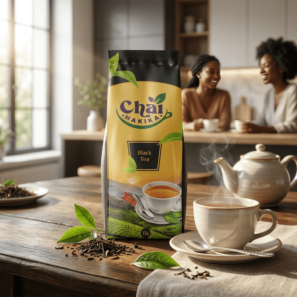
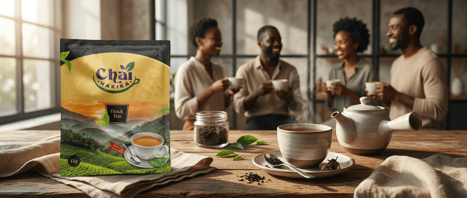
Barracuda Advertising designed the logo and packaging for Chai Hakika, a Nairobi-based tea brand sourcing high-grade tea from the Mount Kenya region.
The engagement began with the mark — a logo built to carry the brand’s promise of authenticity and origin, “Hakika” meaning certainty, truth — before extending that identity into packaging designed to signal provenance on shelf: premium, rooted in place, and confident enough to stand next to established tea brands without borrowing their visual language.